 Ezra Mustra
Case Study: Designing Accessible Color for Customer Dashboards
An inclusive approach to data visualization that enhances readability and aligns with system-wide design standards.
Overview
Our team set out to redesign the default data visualization color palettes used across our customer dashboards. The goal was to create a scalable, accessible system of color palettes that harmonized with our new design system, supported both light and dark modes, and presented clear distinctions between data points even for users with color vision deficiencies.
Client:
Qualtrics
Role:
Senior Product Designer
Timeline:
1 month
Tools:
Figma, Viz Palette, Figma Plug-ins for Color Contrast and Color Simulation
Challenge
Create a new set of default palettes available to all customers in their dashboards. The existing color palettes were out of sync with the new brand and design system. They were only designed to be used with a white background, but lacked sufficient color contrast, and they posed difficulties when interpreting data in many categories.
To address accessibility requirements, there was a single high-contrast palette intended for audiences with visual disabilities, but it could only be applied by the dashboard editor. Why not make every palette accessible?
New Palette Requirements
- Use updated design system colors
- Passed accessibility standards for color contrast with background (3:1 or more)
- Support light and dark mode color mapping
- Repeat logically when the number of data points exceeds the number of colors
- Ensure neighboring colors are distinguishable, even when considering varied forms of color blindness
Approach
Audit and Accessibility Research
I conducted a thorough accessibility audit of the current palettes using tools like WCAG contrast checkers and simulators for various types of color blindness.
When tested, 50% of all colors failed to meet the accessible guidelines of having 3:1 or greater color contrast ratio. One way to mitigate contrast issues is to add a border around elements like bar graphs, but this doesn’t translate well for certain visualizations like line graphs.
Testing the palettes with a color deficiency simulator helped me identify when neighboring colors were not differentiated.
Palette Design Criteria
My team and I also audited the existing palettes against user needs. Each palette needed to support both visual clarity and emotional tone. We identified key use cases and grouped them into these palette types:
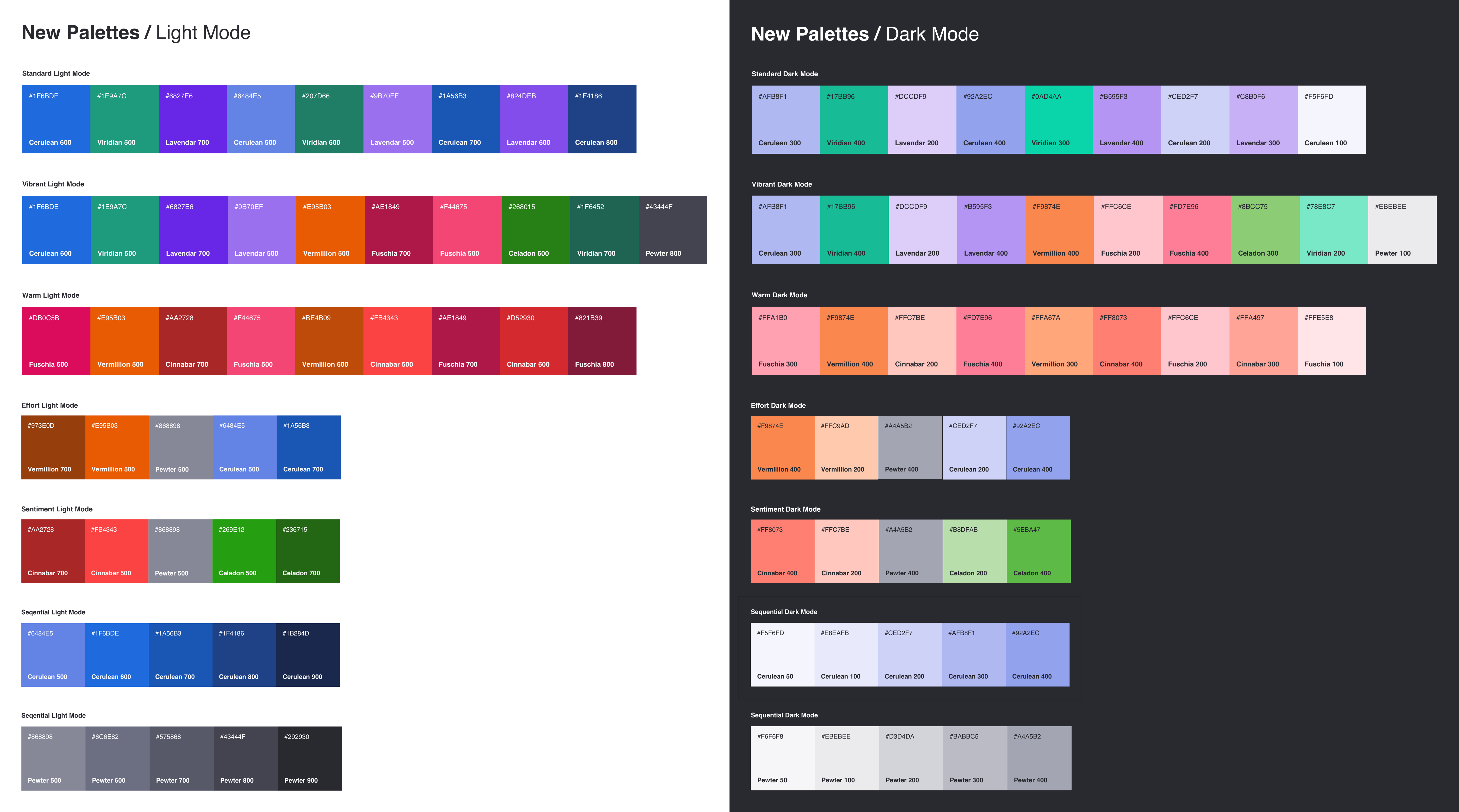
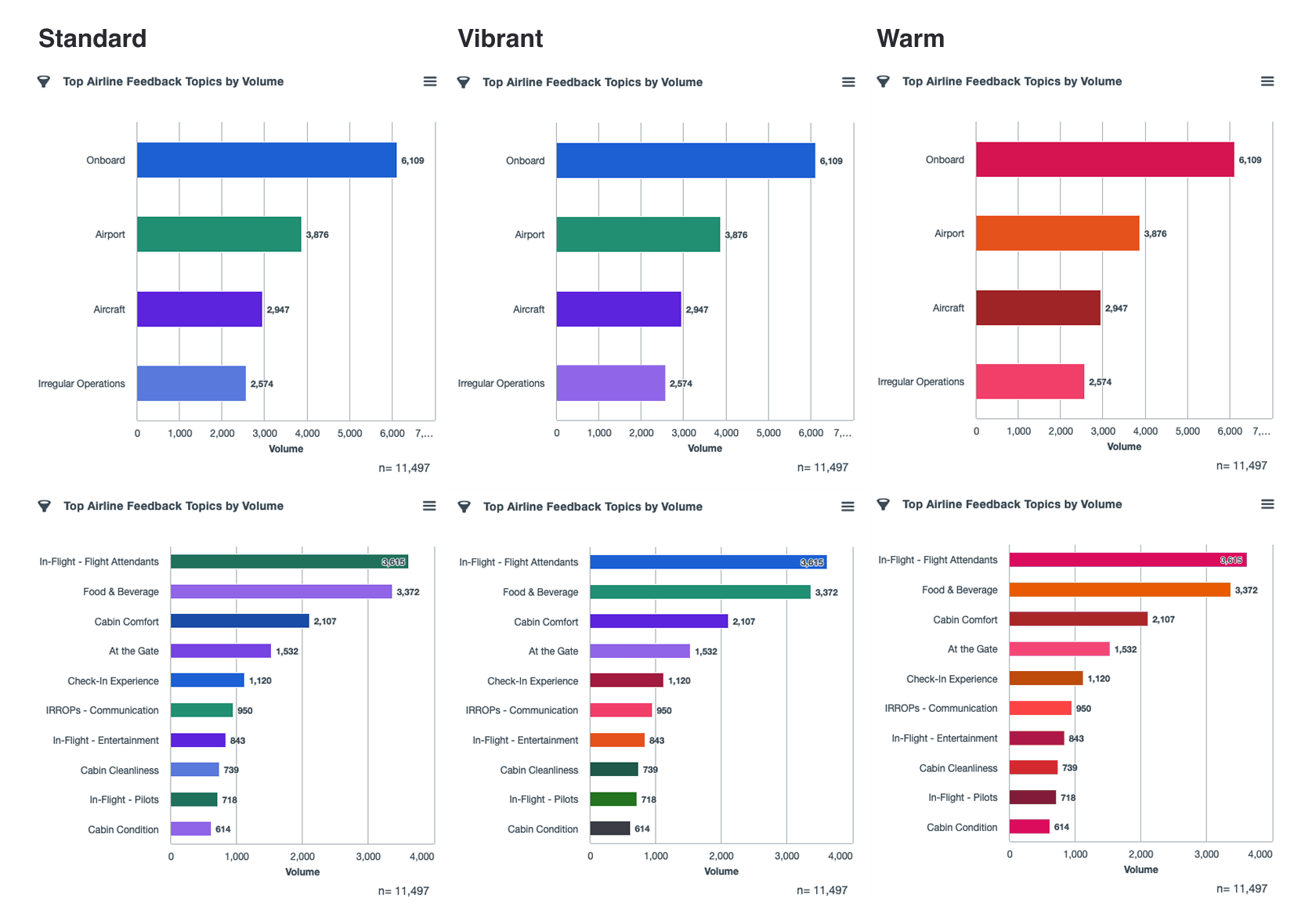
- Standard: a cool-toned palette with 9 unique colors for general categorical data
- Warm: a warm-toned palette with 9 unique colors for general categorical data
- Vibrant: a set of 10 unique colors that maximizes contrast with the background for general categorical data
- Sequential: two 5-color sequential palette using lightness and darkness to communicate ranked or graduated data
- Divergent Sentiment: a 5-color palette from red (negative sentiment) to green (positive sentiment) for visualizing deviation from a neutral midpoint
- Divergent Effort: a 5-color palette from orange (high effort) to blue (low effort) for visualizing deviation from a neutral midpoint
System Integration
To ensure consistency with our new design system, I used the predefined 8 color ramps (each with 10 values) as building blocks. These ramps were designed with accessibility in mind, making them an ideal foundation. I mapped each palette type to specific values from the ramps, testing combinations iteratively.
Color Theory and Semiotics
I considered color theory and color semiotics to ensure meaning was implied for certain palettes, but wasn’t unintentionally implied for others. For example, as a US-based company we use red to mean negative sentiment in our language analysis, but for eastern cultures red is associated with fortune. For our enterprise customer Target, red is associated with the brand and should not be used to imply negative feedback.
Within our own color system, the color Cinnabar 500 has different visual meanings in different contexts. When designing palettes it was important to control for the order colors appear to ensure appropriate contrast with neighboring colors when a visualization contained 1, 2, 3, 4, or any number of data points.
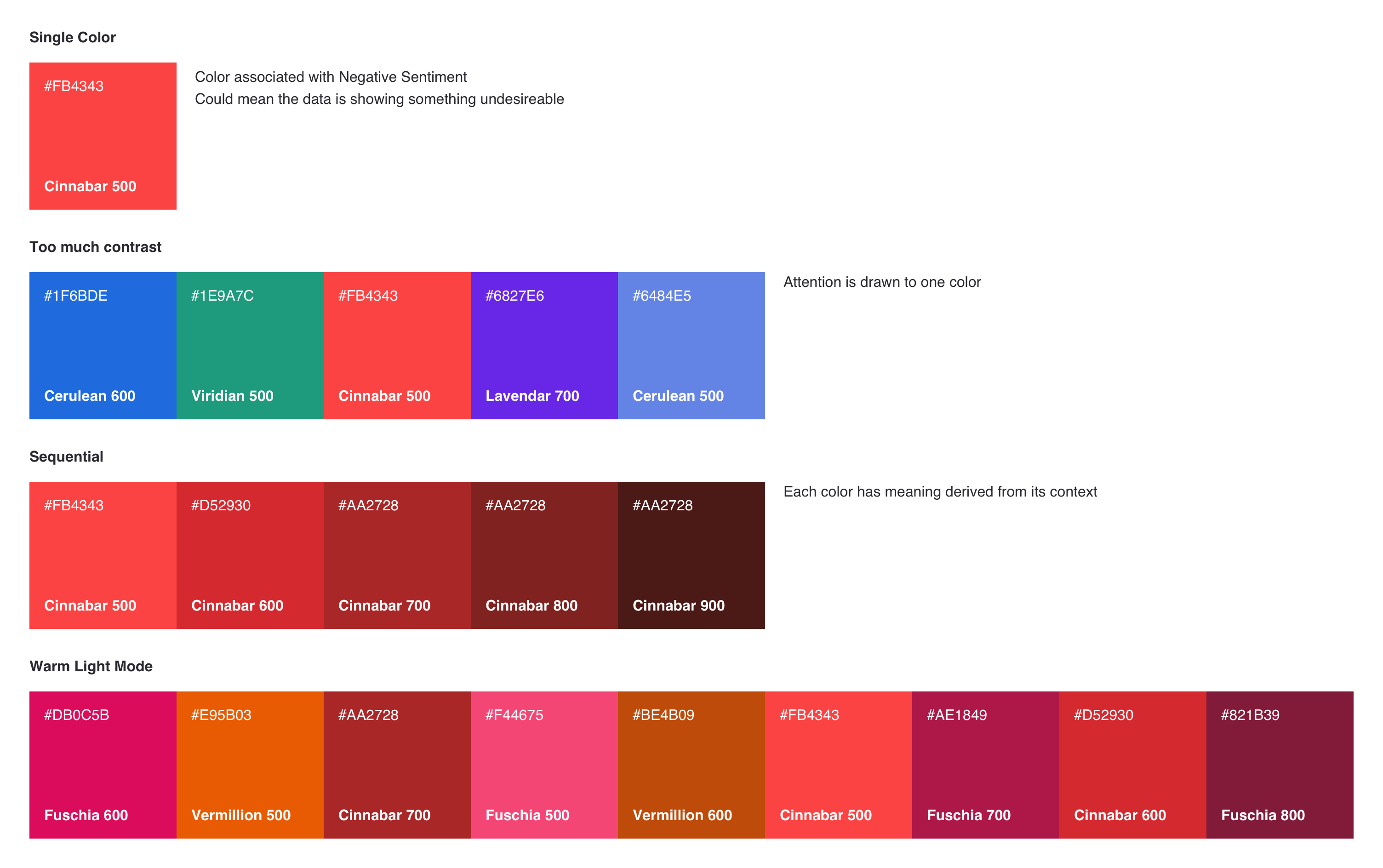
One way to make our palettes more accessible for users with color deficiencies is to choose colors from separate color ramps to place next to each other. For example, choosing Fuschia 500 and Vermillion 500 as neighbors would likely not be distinguishable for users with certain color deficiencies, but Fuschia 500 and Vermillion 700 would have visual contrast even in grayscale.
Prototyping and Testing
Using Figma and data visualization tools, I prototyped each palette across both light and dark themes. I simulated common color vision deficiencies and ran usability tests internally to confirm that the palettes were distinguishable and readable.
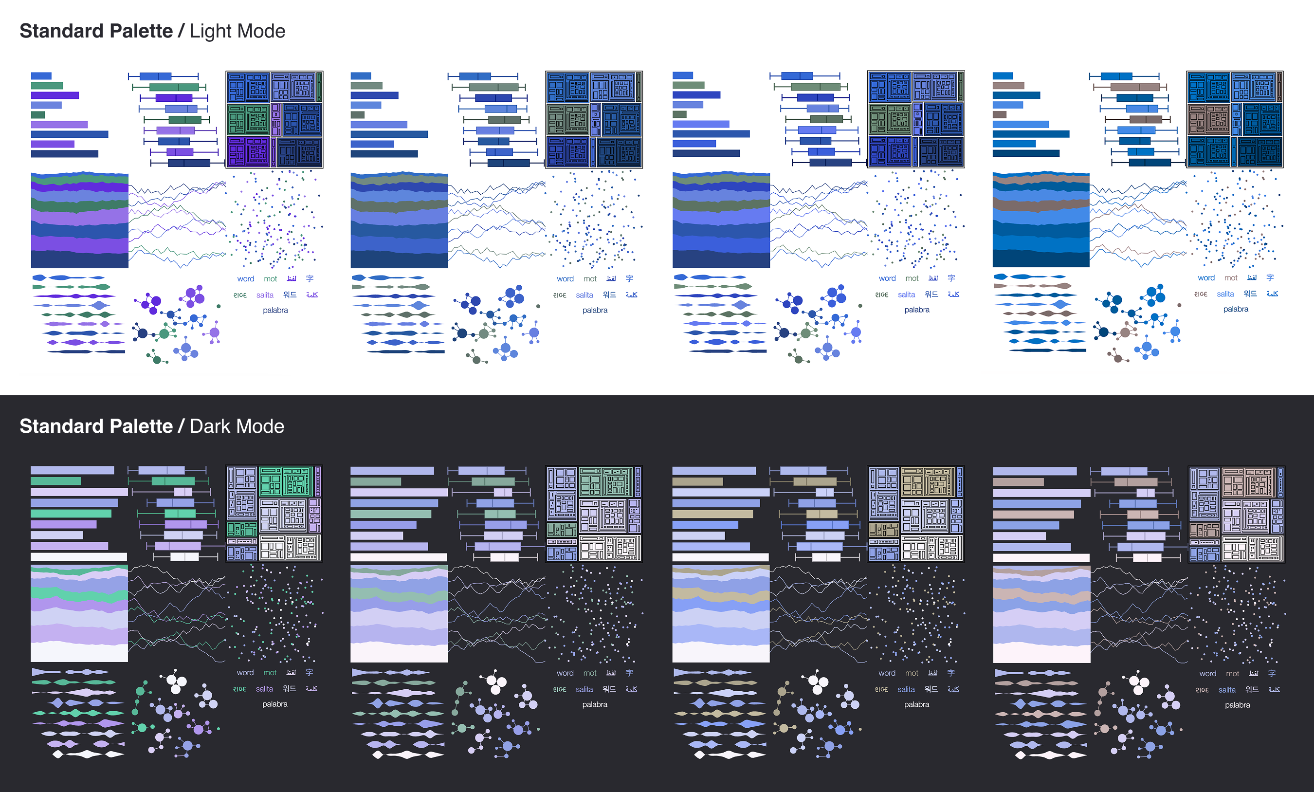
I also built a system for fallback and repetition logic, ensuring that when data visualizations included more categories than colors, the palette would repeat with minimal confusion—by maintaining color order and legibility.
Outcomes
The final result was a set of seven color palette groups that are fully accessible under WCAG 2.1 AA guidelines, adaptable to both light and dark themes, and aligned with our design system for long-term scalability. These palettes significantly improve readability and data comprehension across customer dashboards and give product teams the flexibility to select the right palette for their use case.
The new palettes are now used across all customer-facing dashboards and internal reporting tools, providing a consistent, inclusive, and professional visual language for our data.
Additional Accessibility Measures
In addition to redesigning the color palettes, our team took several steps to improve accessibility across data visualizations:
- Added a viewer-facing toggle to switch the dashboard between pattern fills and color fills for additional differentiation between data points.
- Standardized tooltip behavior and labels across data visualizations
- Supported keyboard navigation for interactive charts
- Advocated for screen reader compatibility to ensure information was accessible to all users
- Helped define best practices for accessible chart interactions across the product
These enhancements laid the groundwork for a more inclusive experience throughout the customer dashboards.