 Ezra Mustra
Case Study: PAICE Design Systems
Unified Impact Through Interlinked Design Systems
Overview
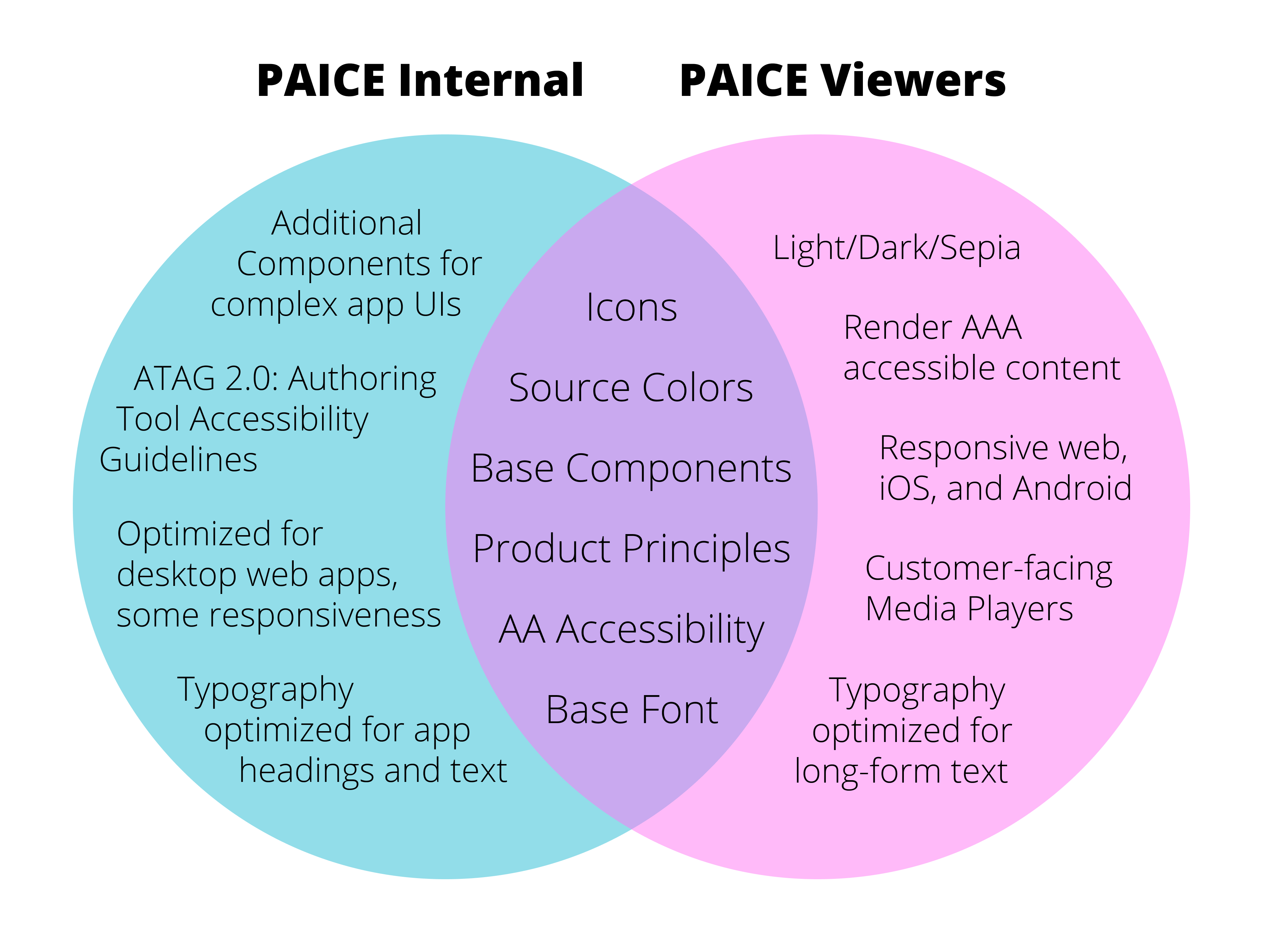
My team established a pair of new interconnected design systems to unify PAICE, Pearson’s suite of authoring, content management and AI tools. Our design systems share colors, fonts, design patterns, icons, and many components so the internal UIs align with the content preview. The PAICE UX Design System is for the authoring and course-creation side of our suite, while the Viewers Design System is for previewing and rendering authored content. Maintaining two systems gives us the flexibility to make decisions that best serve our separate audiences and business needs.
Client:
Pearson
Role:
UX Design Lead: Planning, Analysis, Component Maintenance, Documentation
Timeline:
9 months from research to adoption
Tools:
Figma, Material UI (MUI) React Library, Confluence
Challenge
The PAICE suite was initially built by siloed teams of managers and developers with little to no design input. This resulted in applications with inconsistent visuals, conflicting design patterns, and significant accessibility issues. There was also a notable divide between authored content and rendered output. To establish the seamless, quality experience throughout our suite, we needed a holistic, systematic, and scalable approach. My team sought to develop two interconnected design systems: one for internal applications and another for learner-facing platforms.
High Level Goals:
- Consistency: Foster a unified design language across teams to deliver a seamless experience throughout PAICE.
- Scalability: Scale designs effortlessly while reducing onboarding time as the team grows
- Quality: Enhance collaboration to reduce UX debt, minimize bugs, and improve accessibility
- Efficiency: Streamline design processes, focusing creativity on user flow and logic, while reducing redundancy
Scope:
- Define colors, typography, design patterns, icons, and reusable components
- Create Figma component libraries
- Write all documentation for design and development
- Host collaboration and onboarding sessions with the various software teams
Constraints:
- Need to align with Pearson Brand Guidelines
- Need to use components from the MUI React library
- Limited design and engineering resources
- Need to support a phased release
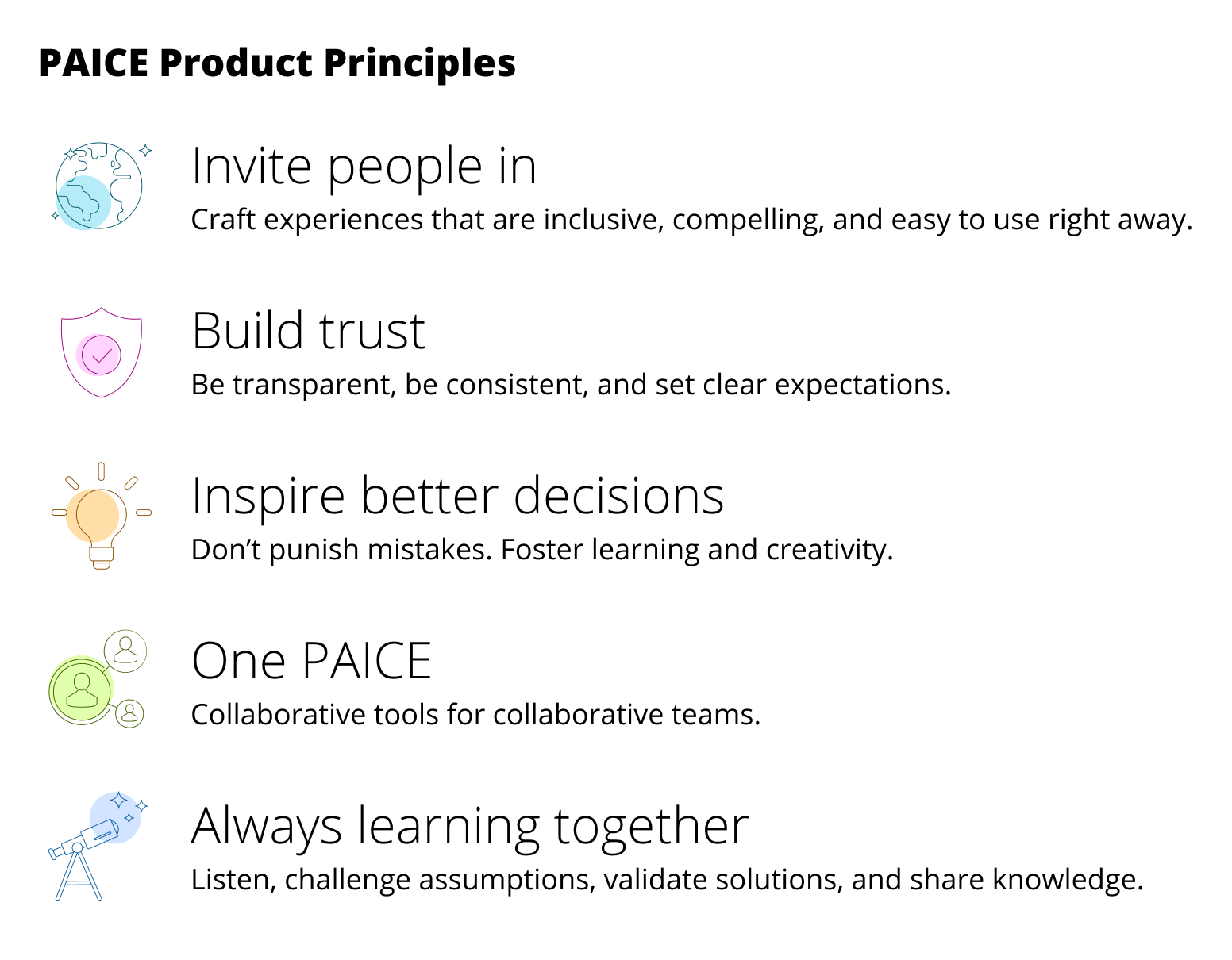
Product Principles
Product principles are a set of guiding values and beliefs that help teams make consistent decisions when designing, building, and evolving their products. This is especially important to align teams and applications across the PAICE suite.
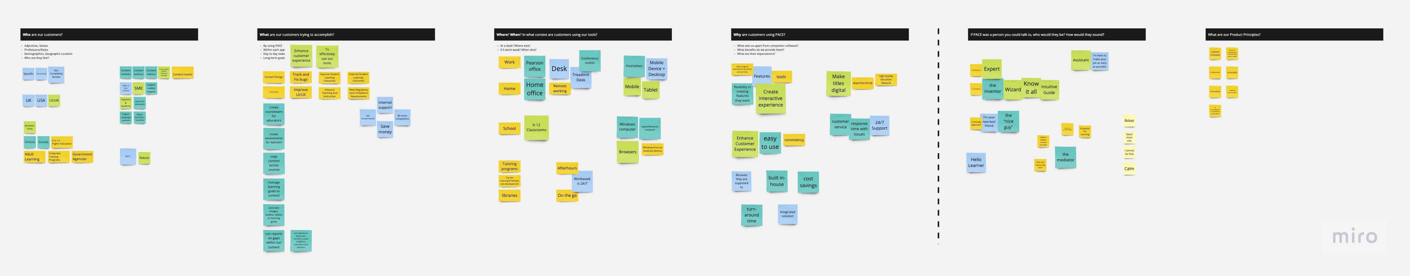
To create our Product Principles I hosted multiple collaborative ideation sessions combining my design team with leaders across PAICE, then consolidated the results into a set of 5 Product Principles. In one session participants were asked questions about who our audience is, what they’re trying to accomplish, and why they do or should use our tools so that we could ultimately answer who we want to be to them.
Our product principles were built on Pearson’s values to define a cohesive framework that encompasses the experience we want to deliver and how we want to work together. They are the north star for all team activities from refining team processes to assessing user flows and conducting heuristic evaluations.
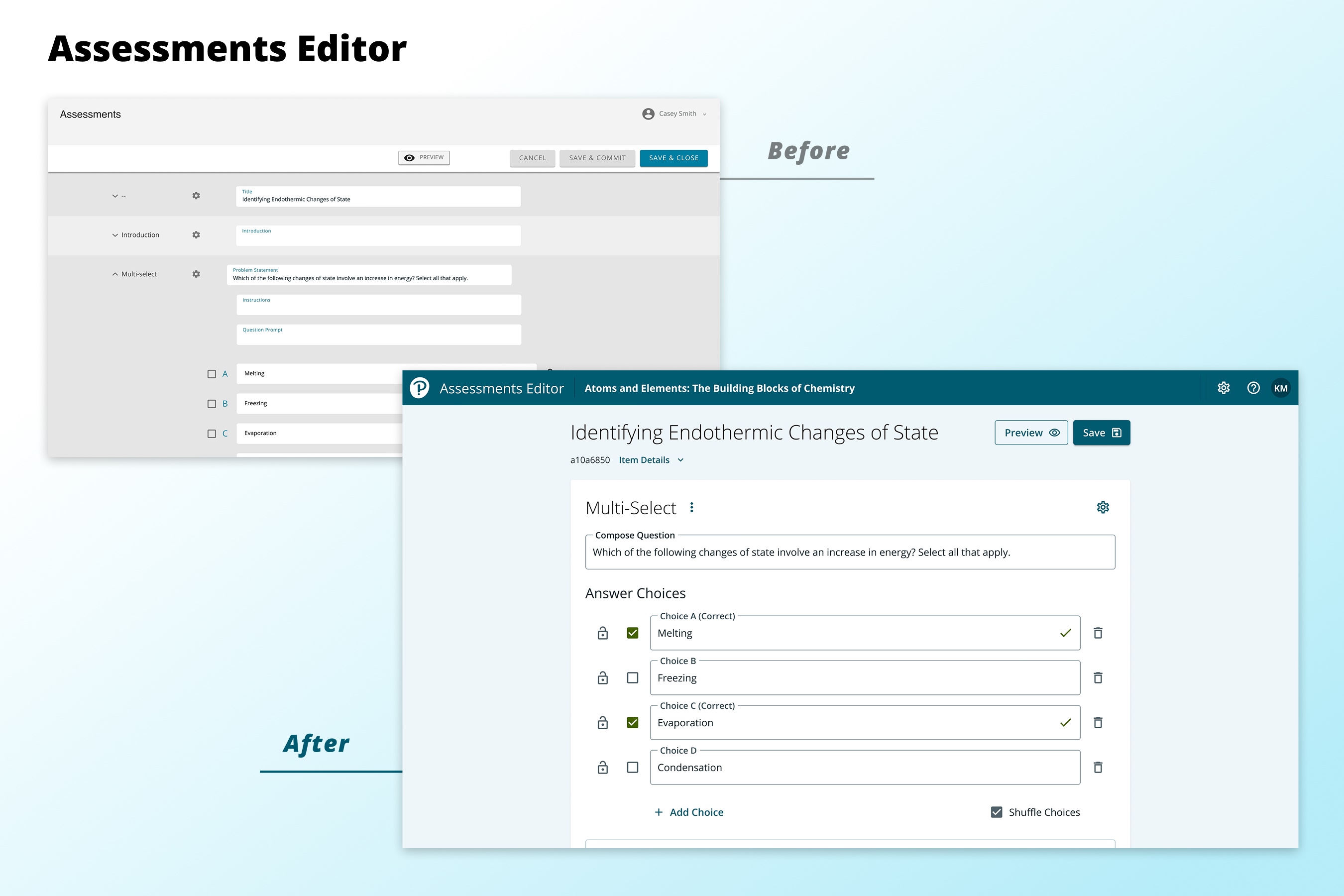
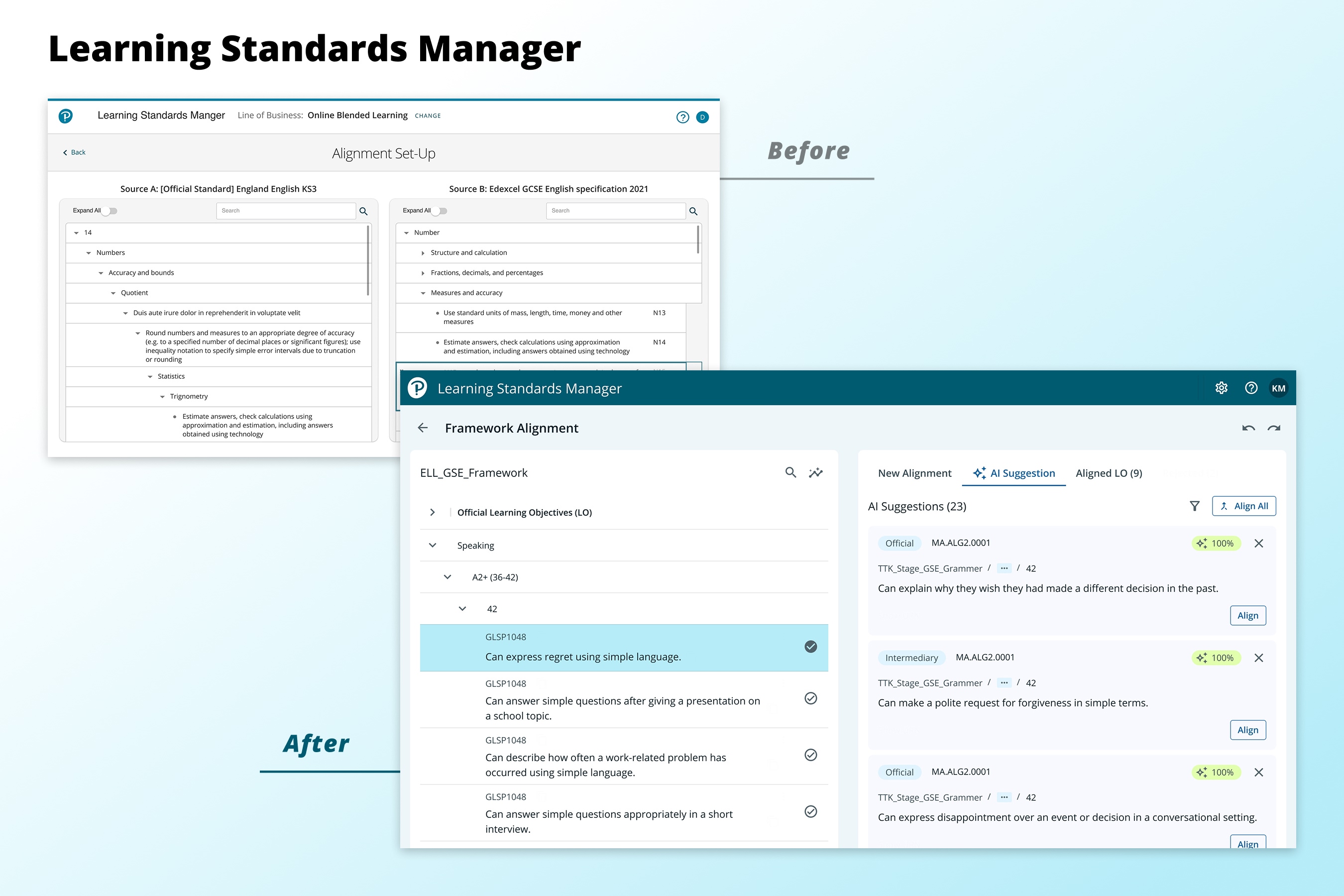
Creating Component Libraries
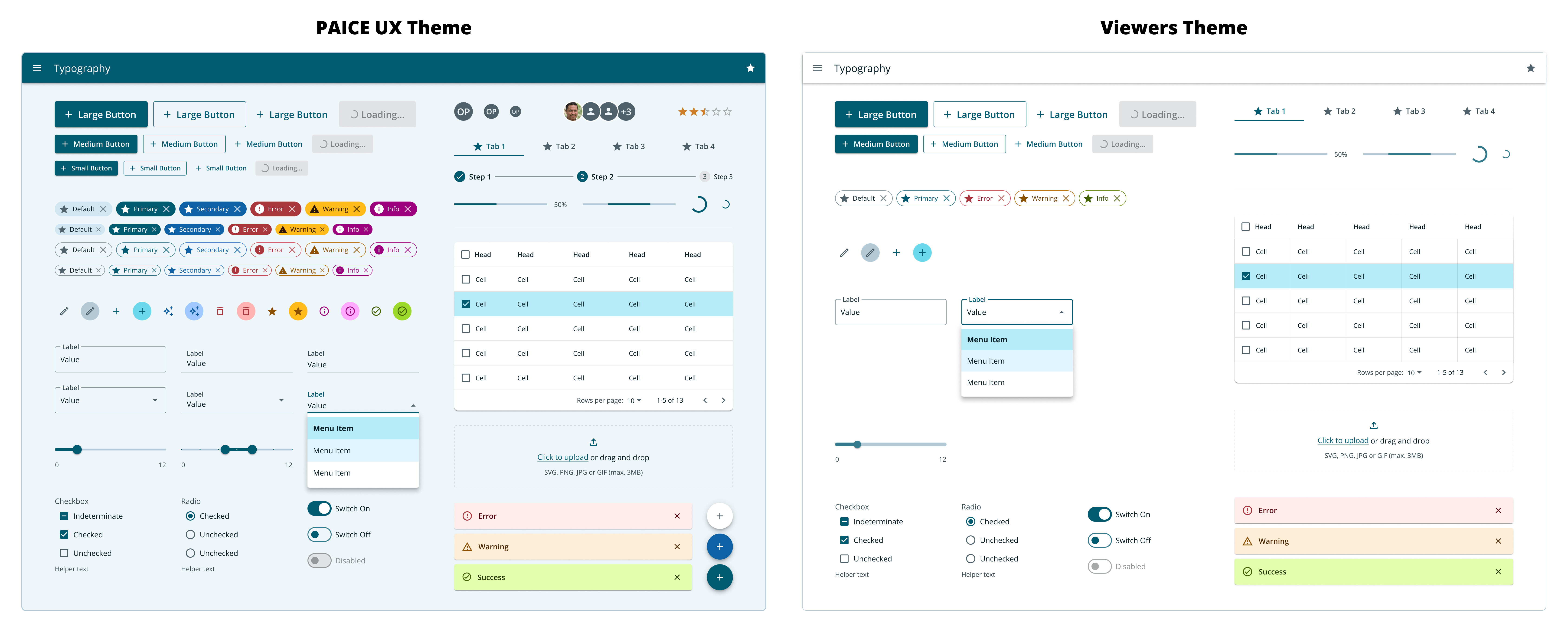
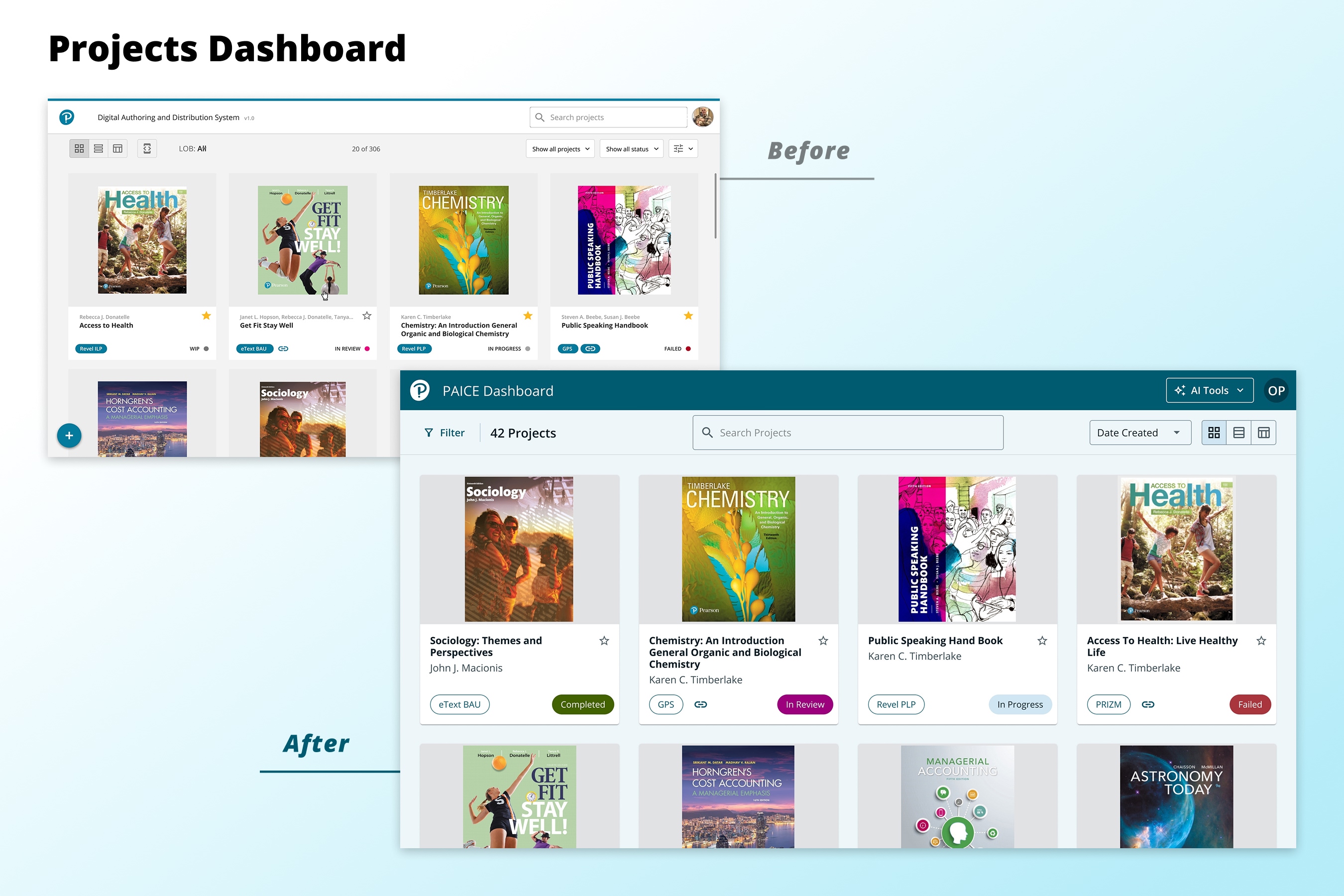
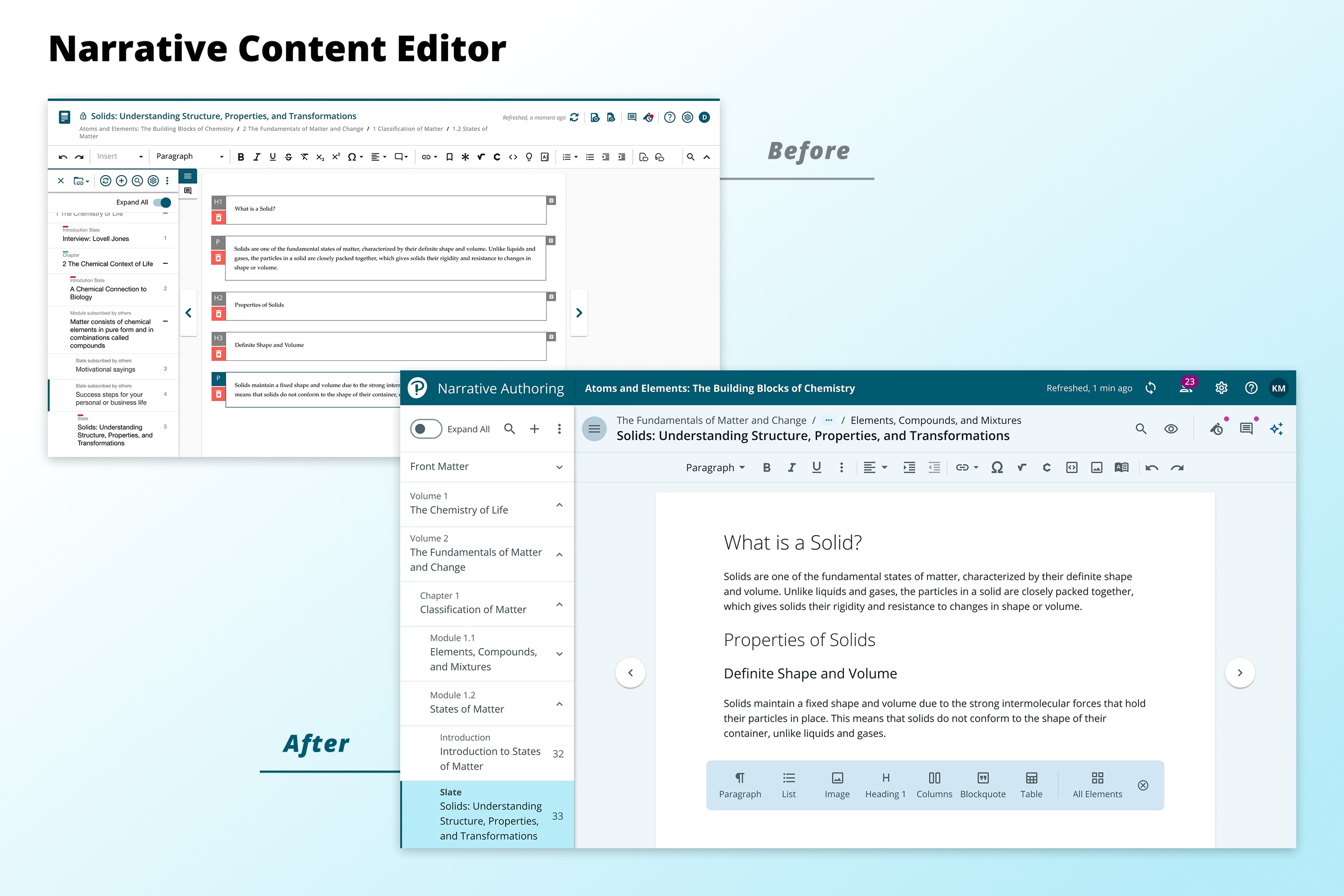
One challenge to unifying our designs was that we did not have a shared library of reusable components. Building a full library can be very time consuming, especially considering the complexity of our existing UIs. Luckily, the React framework we were using to build our suite had a pre-built library that we were able to purchase and immediately use. Though it wasn’t exactly aligned with the code, it was close enough that we could fill in the gaps. We were able to update the color and typography styles in one location and immediately see them applied throughout the entire library.
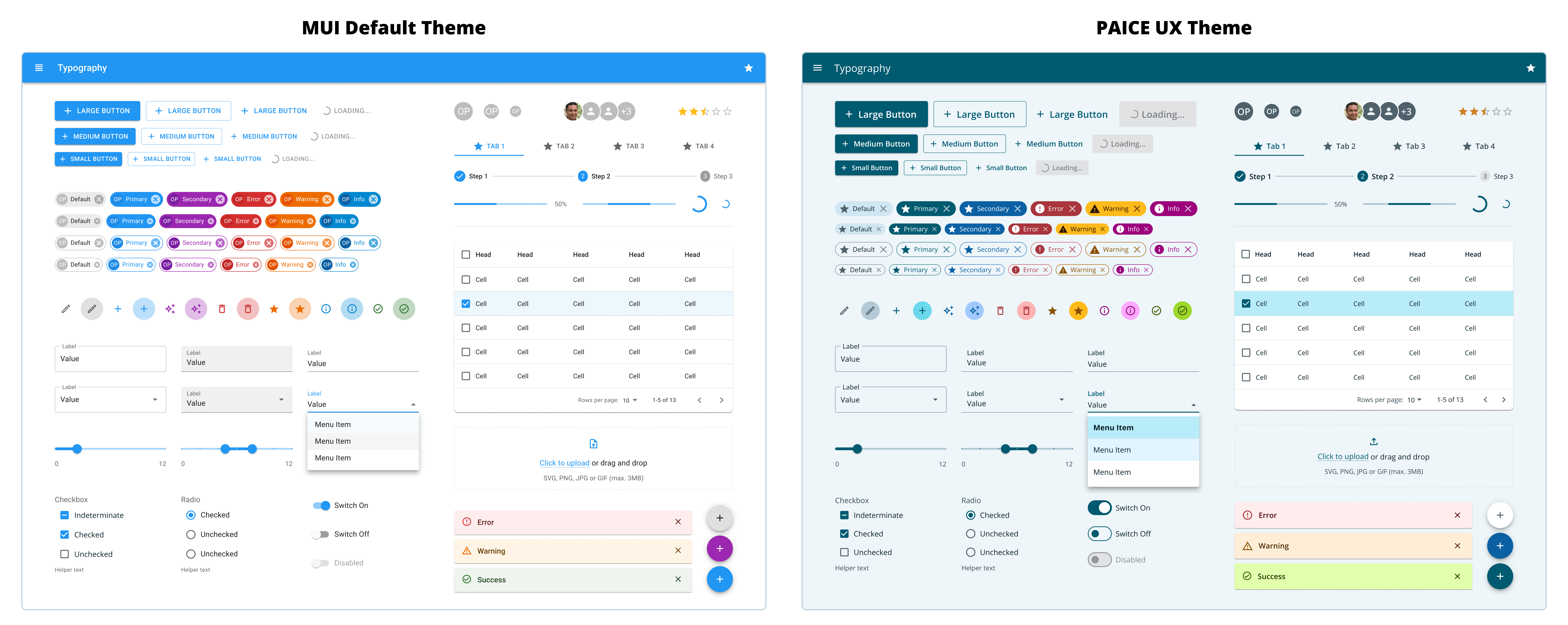
To create our library for Viewers library, we duplicated the library with our updated theme colors, then made adjustments to better fit our use case. We were able to remove components and variants that wouldn’t be supported for rendering (like the floating action button or FAB) or wouldn’t meet our stricter accessibility requirements (like the dense variant of menus that wouldn’t meet minimum size requirements for touch screens).
Color System
Our existing applications each had their own unique colors, one even had different primary palettes within the same app. We needed our new color system to provide a rich palette that would reflect the Pearson brand, meet accessibility guidelines for color contrast, and could be applied to the MUI theming framework.
Analyzing the MUI Library
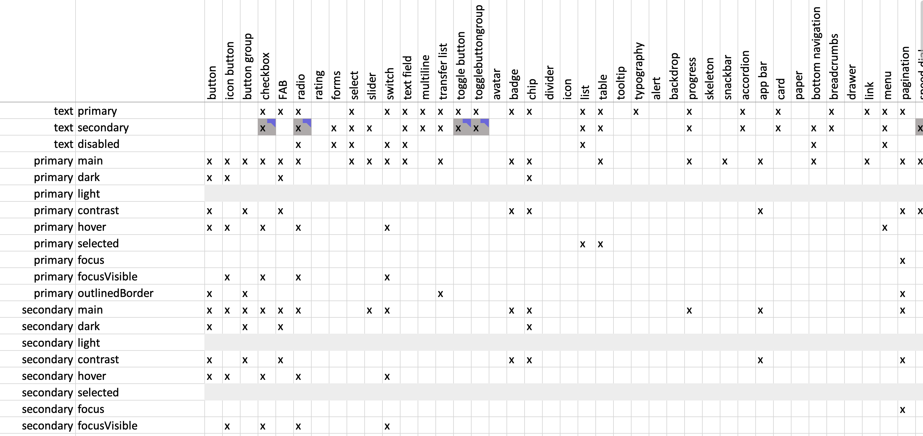
We audited the MUI Library by listing all color tokens, noting all their usage in components, identifying any inconsistencies with the code implementation, and noting unused tokens. This process ensured that we could make thoughtful changes to color tokens with predictable results. At this time we also tested color contrast across all components and flagged any accessibility issues.
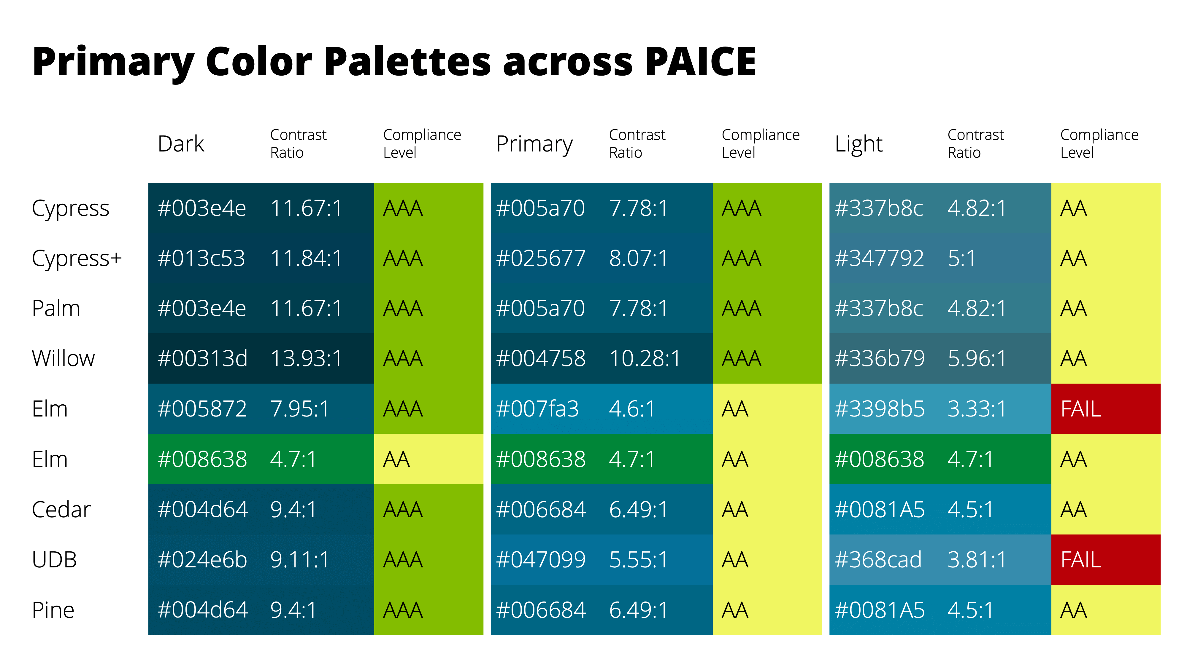
Generating Palettes
To create our color system I generated palettes using our Pearson brand colors. Each palette had 11 values to create a range of light to dark shades. I mapped the colors from the generated palettes to colors in the MUI library.
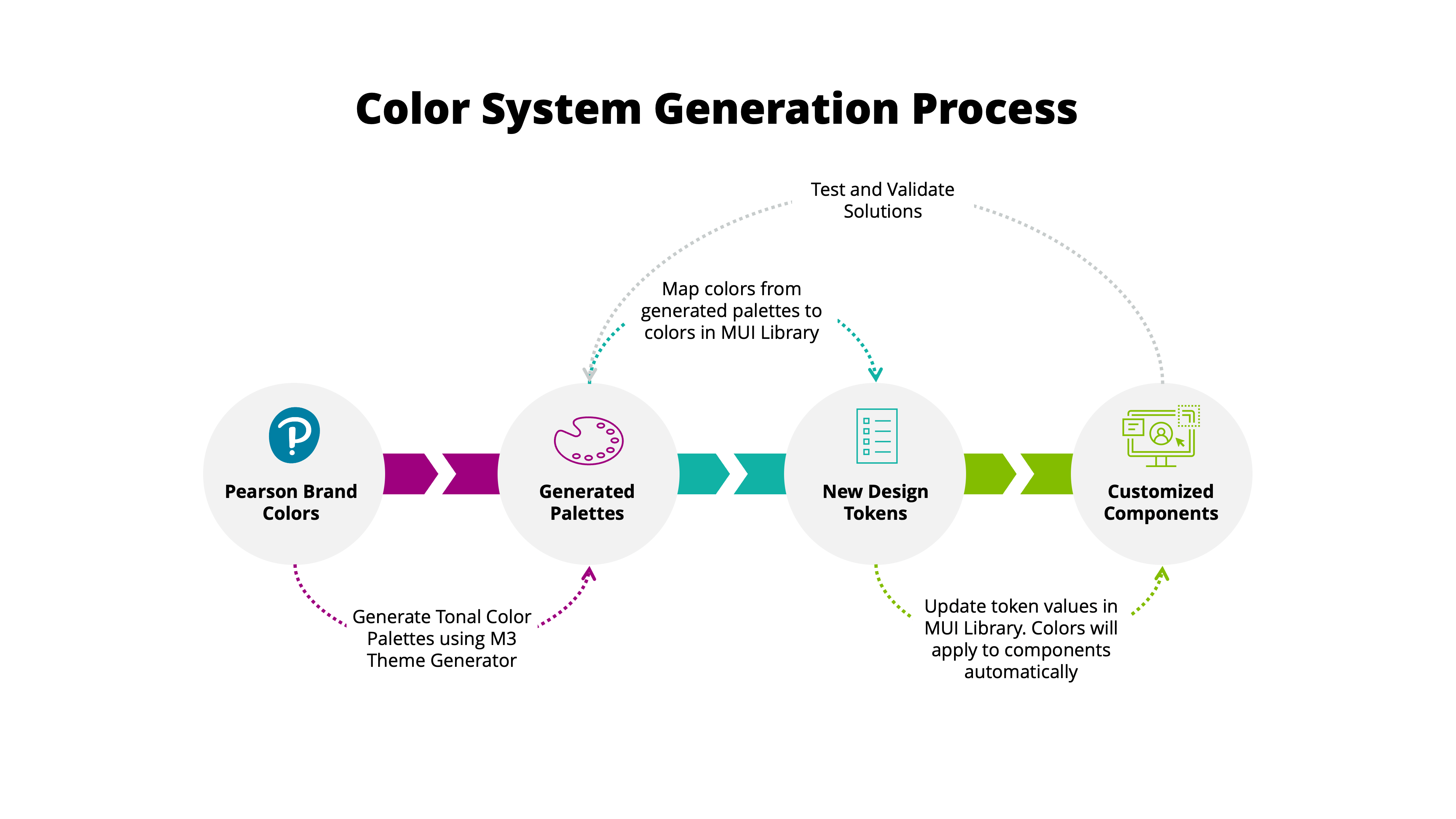
Initially I tried to follow the MUI color implementation exactly, but the colors relied heavily on transparency and created many accessibility issues while looking dull and inconsistent with our brand. I revisited the palette implementation and chose an approach that would use the brighter light colors in our palette. All the color tokens within the library would map to the colors from our broader system. To swap a color, the name of the token would stay the same, but the value could be easily swapped out in one location that would populate to the rest of the theme.
Color Accessibility
To ensure accessible color contrast across our design system, we tested color combinations and created a color usage chart. We tested the primary, secondary, and semantic colors against our 2 neutral colors, and removed failing combinations. We did not combine non-neutral colors to avoid potential issues for people with color blindness. We labeled all passing combinations based on their acceptable usage. Then we used this chart as reference when we assigned new color values to our library.
Color Modes
We expanded the Viewers library to include light, dark and sepia color modes. For these color modes it was very important that we maintain the primary palette so that it could be swapped out depending on the learning platform’s branding. Inspired by Material Design 3, we used a systematic approach to create a dark mode using the same color palettes, and maintaining accessible color contrast.
For our sepia mode we swapped our neutral palette for brown tones, but maintained our primary palette to meet our customer’s requirements for consistent branding. Sepia mode is not necessarily an accessibility requirement, but is considered to be more comfortable for some learners. We allowed for some reduced color contrast in sepia mode in favor of color creating a subdued reading experience.
Typography
Similar to our workflow for determining colors, we analyzed all typography within the Material Design Guidelines and MUI components. It was important that we keep the same naming as MUI so that the typography changes could be implemented through the just theme file rather than customized per component.
From our analysis we determined how we could improve accessibility, align with the Pearson brand, and support our UI needs. We updated the font to Open Sans, the primary font used by Pearson. We reduced the size of many headings to fit better within our software, but made sure to keep a clear visual hierarchy using varied font weights. We increased the size of many of the smaller text elements and moved the minimum font size to from 10px to 14px. We also improved readability by adjusting line heights, removing use of ALL CAPS and resetting letter-spacing adjustments.
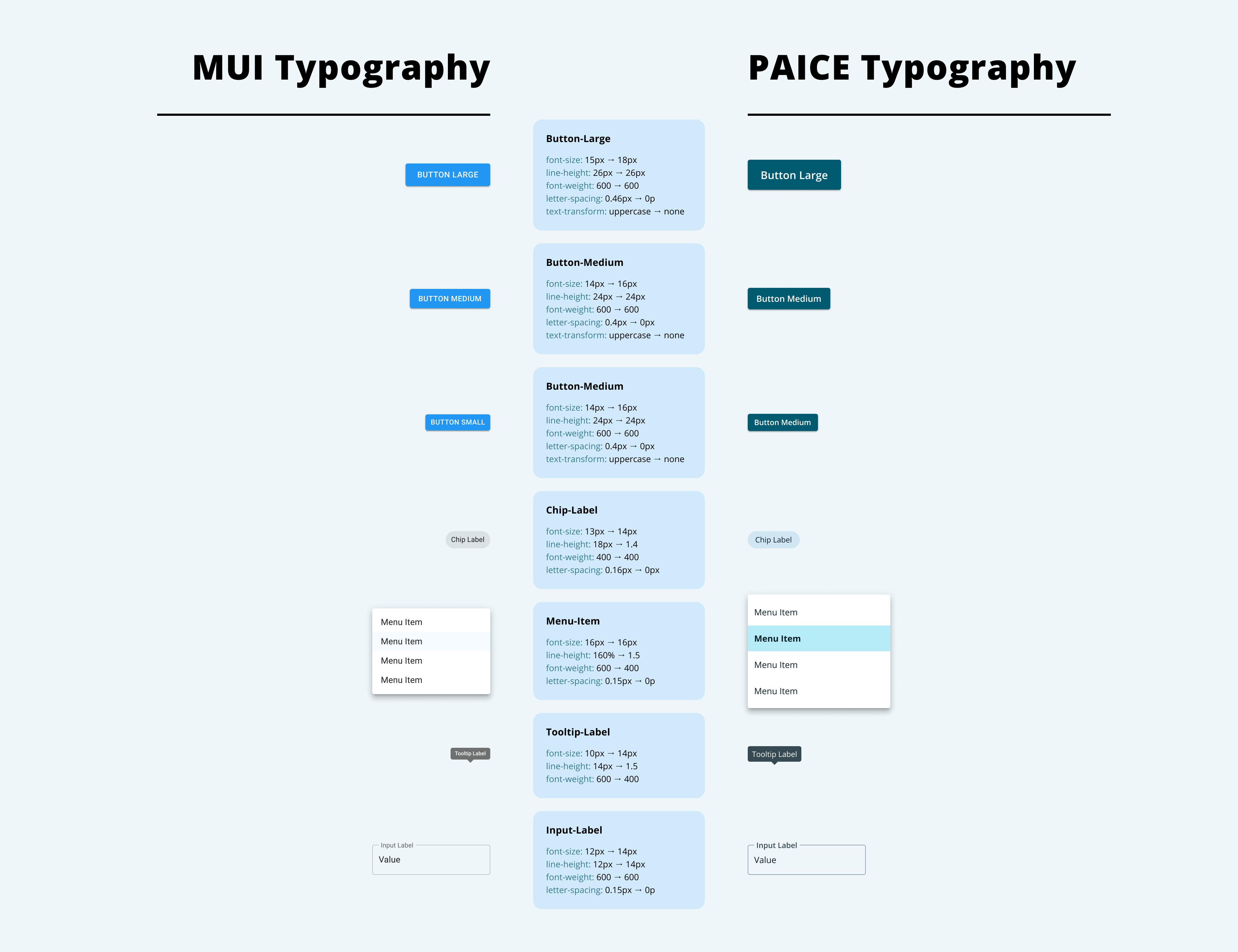
As a note, the font sizes listed in our analysis are in pixels, but we provide our typography styles in REMs to support accessibility guidelines for scaling.
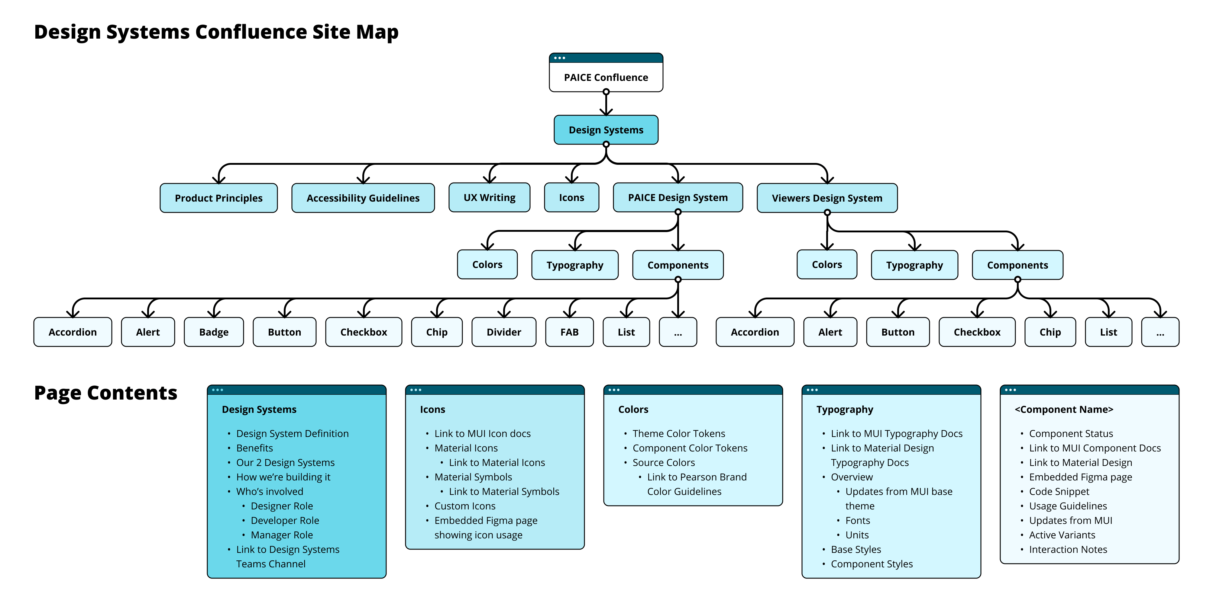
Documentation
Along with our Figma Libraries, I’ve helped establish a Confluence site for design systems. I like using Confluence because the developers are already familiar with it, coworkers can receive notifications when pages are updated, and I can embed the Figma pages for added clarity. In our documentation, we lean heavily on Material Design 2 and 3 for design and interaction guidelines, and the MUI documentation for our individual components. Instead of creating redundant work, I focus on recording changes we’ve made from the library, any usage rules we’ve established for consistency across our applications, and highlighting any information I think will help developers maintain consistency across codebases.
Adoption
During the adoption phase, we focused on gaining alignment across teams and integrating the design system into active projects without disrupting delivery timelines. We created documentation, held regular check-ins with developers, and prioritized high-impact components to build trust and show immediate value. This phase laid the groundwork for broader adoption by demonstrating how the system could improve consistency and speed.
Impact
Implementing the design system has been a game-changer for our team. Designers are now able to create functional, accessible experiences more efficiently, focusing their energy on refining user flows rather than aesthetics. Collaboration has improved across the board—developers benefit from familiar components that streamline handoff, and stakeholders engage earlier thanks to polished, modern visuals that inspire confidence from the start.
Beyond the tangible results, this project has been a powerful learning experience. It reinforced my belief that even the most complex challenges can be solved with the right mix of structure, research, organization, and a bit of scrappy ambition. Delivering a scalable solution across multiple development teams required precision and thoughtful decision-making at every step. I’m incredibly proud of the outcome, and I’m confident that the system we built will continue to empower teams and elevate our products well into the future.